5 Signs Your Website Is Costing You Clients
Your website might look fine to you. But 'fine' doesn't book appointments. Here are five signs your site is actively driving potential clients to your competitors.
Here's what nobody tells you: a bad website doesn't look bad to the person who owns it. You built it (or paid someone to build it), you've looked at it a hundred times, and it seems fine. It has your phone number. It has your services listed. It has a nice photo or two.
But "fine" doesn't convert. "Fine" doesn't book appointments. "Fine" is the reason you keep running ads without seeing a return. Let me show you the five signals I see in virtually every assessment — and what to do about them.
The uncomfortable truth: Most business owners don't realize their website is the problem until they see someone else's website converting at 5x their rate. By then, they've been bleeding leads for months — sometimes years.
1. Your Bounce Rate Is Above 60%
A bounce is when someone lands on your site and leaves without clicking anything. One page, one visit, gone. The industry average for service business websites is around 45-55%. If you're above 60%, your site is actively repelling visitors.
High bounce rates usually mean one of three things: the page loaded too slowly, the visitor couldn't immediately find what they were looking for, or the design didn't inspire enough trust to keep scrolling. All three are fixable. None of them are optional.
Check your Google Analytics. Look at the bounce rate for your homepage and your top landing pages. If those numbers are north of 60%, every dollar you spend on marketing is working against a broken funnel.
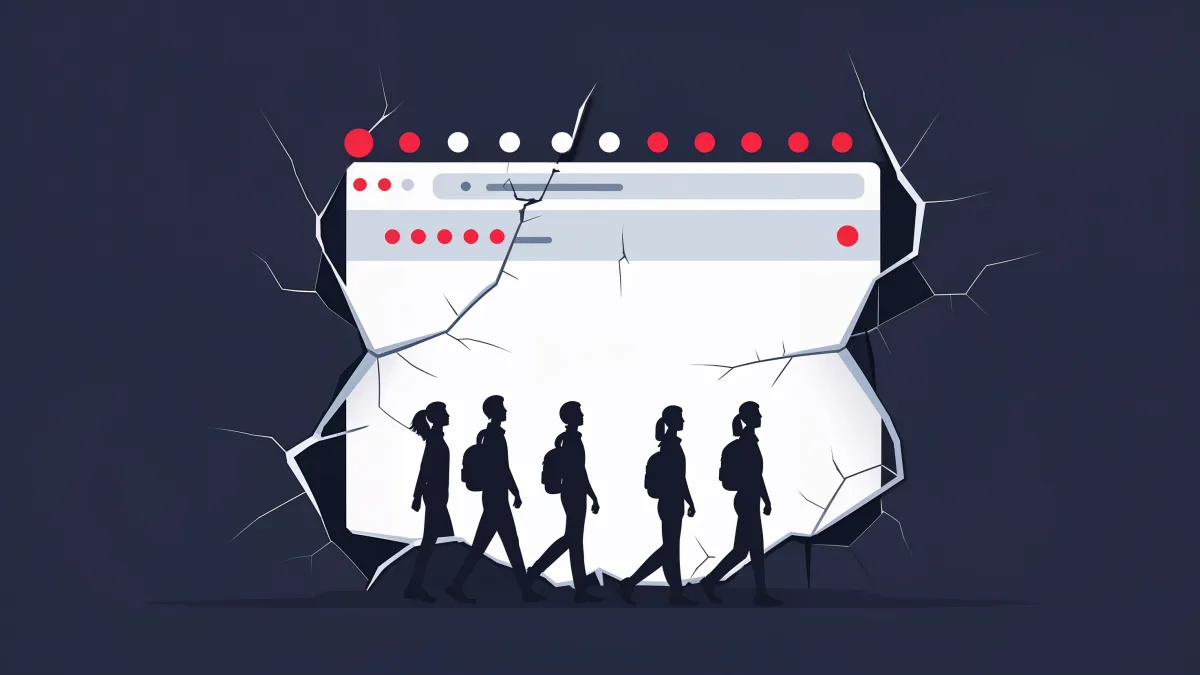
2. Your Phone Isn't Ringing (But Your Traffic Is Fine)
This is the telltale sign. You're getting visitors — maybe from ads, maybe from organic search, maybe from social media — but they're not converting. They're not calling, not filling out forms, not booking.
The gap between traffic and conversions is almost always a website problem. It means people are finding you, they're interested enough to click, but something on your site loses them. Maybe the call-to-action is buried below the fold. Maybe the copy doesn't speak to their specific problem. Maybe the form asks for too much information and they bail.
Quick diagnostic: Ask five people who don't know your business to look at your homepage for ten seconds, then close it. Ask them: What does this company do? Who is it for? What should I do next? If they can't answer all three, your site is broken.
3. Your Site Looks Different on Your Phone Than Your Computer
Pull out your phone right now and open your website. Actually do it. Does the text look cramped? Are buttons overlapping? Is there a massive image that takes forever to load? Can you tap the phone number to call directly?
Over 60% of web traffic for local service businesses comes from mobile. If your mobile experience is anything less than seamless, you're losing the majority of your potential clients. This isn't a "nice-to-have" optimization — it's where most of your buyers are.
A lot of business owners only ever check their website on a desktop browser. They have no idea that on mobile, their site is a nightmare. Text overflows, images are cut off, the contact form requires pinch-to-zoom. That's the experience most of their prospects are having.
4. You Can't Tell a Visitor What to Do in Five Seconds
Open your homepage. Start a timer. Within five seconds, can a first-time visitor understand what you do, who you serve, and what action to take? If the answer is anything other than an absolute yes, you have a conversion problem.
The best-converting websites have three elements above the fold: a clear headline that speaks to the visitor's pain, a supporting line that explains the solution, and a prominent call-to-action button. That's it. No sliders, no animations, no "Welcome to our company" — just clarity.
Every second a visitor spends confused is a second closer to them hitting the back button. The businesses that win online make the first five seconds count.
5. You Haven't Updated Your Site in Over a Year
Websites aren't wine — they don't get better with age. Design trends evolve, Google's ranking factors change, your competition updates their sites, and your own business probably offers different services or serves different areas than it did twelve months ago. If that's you, a website redesign is usually cheaper than fighting the problem with more ads.
An outdated website sends a specific signal to visitors: this business isn't paying attention. If the copyright in your footer says 2023, what does that tell a potential client about how responsive and detail-oriented you'll be with their project?
Beyond perception, stale websites lose search rankings. Google favors fresh, relevant content. Sites that regularly publish new content and update existing pages signal to Google that they're active, authoritative, and worth ranking.
The good news: You don't need a full redesign to see results. Often, fixing the top landing page — tightening the headline, adding a clear CTA, optimizing load speed — can lift conversions by 20-30% in the first month. Start there.
The Bottom Line
If you recognized your website in any of these five signs, don't wait. Every day your site stays broken is another day of leads going to your competitors. The fix doesn't have to be complicated or expensive — but it does have to happen.
Related reading: How Much Does a Website Cost for a Small Business? | The Small Business Website Checklist for 2026
Ready to stop leaving money on the table?
Submit the intake and Arseni will build it. 50% deposit, balance on ship.
Get StartedSuggest a Story
Got a tip, trend, or topic we should cover? We'd love to hear from you.
Submit a SuggestionRecommended Reading